This interactive Excel dashboard was designed to efficiently track and manage inspector assignments across multiple projects. It provides a clear visual representation of each inspector’s visits throughout the month, with filtering options by inspector name and month. Key performance indicators are prominently displayed, including the total number of visits, visit distribution by day and project, and a pie chart summarizing project frequency. The dashboard also highlights current and last assignments, along with a dynamic calculation of free days until the next assignment. This tool streamlines scheduling, improves workload visibility, and supports data-driven decision-making for resource planning.

This personal budget Excel dashboard was developed to provide a comprehensive overview of income, expenses, savings, and debt management. It includes dynamic charts and KPIs that track performance against financial goals, giving users real-time insights into their financial health. The dashboard breaks down income and expenses by category, shows progress toward savings and debt repayment, and visualizes income distribution using a pie chart. It also features goal vs. actual comparisons and annual trend lines for both income and expenses, helping users identify patterns and make informed financial decisions. This tool is ideal for personal financial planning and tracking long-term goals.
This Excel dashboard was developed to monitor and evaluate the performance of a management department across various key performance indicators. It features a comprehensive layout with interactive visuals, including progress gauges for six performance indicators, monthly achievement tracking, and comparative charts for both departments and projects. It also highlights overdue tasks with details on delays, open and closed task counts, and provides an overall status summary. Pie charts further visualize workload distribution by department and project. This dashboard is a powerful tool for identifying bottlenecks, improving accountability, and driving strategic decision-making through real-time performance insights.
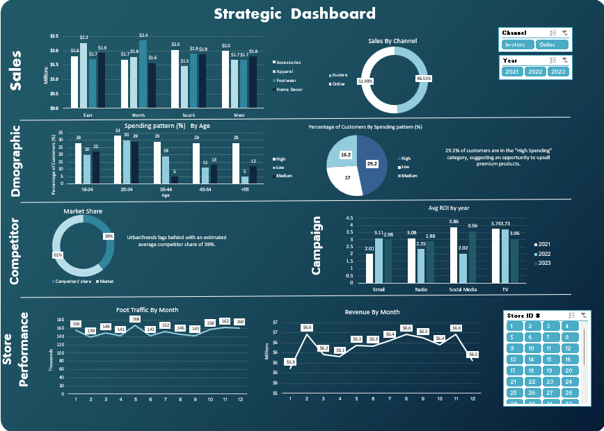
This interactive Excel dashboard provides a comprehensive overview of key business metrics across sales, customer demographics, campaign performance, competitor insights, and store operations. Designed for strategic decision-making, the dashboard includes the following components:
• Sales Analysis: Breakdown by region (East, North, South, West), category (Accessories, Apparel, Footwear, Home Decor), and sales channel (In-store vs. Online).
• Customer Demographics: Insights into spending patterns by age groups and overall distribution of high, medium, and low spenders, helping identify upsell opportunities.
• Market Share Overview: Competitor comparison highlighting strategic positioning.
• Campaign Effectiveness: Average ROI by marketing channel (Email, Radio, Social Media, TV) across three years.
• Store Performance: Monthly trends in foot traffic and revenue, enabling performance tracking and forecasting.
• Interactive Filters: Dynamic slicers for year, sales channel, and store ID to allow real-time analysis and tailored views.
Tools Used: Microsoft Excel (Pivot Tables, Charts, Slicers, and Conditional Formatting)
This dashboard showcases my ability to transform raw business data into actionable insights using Excel, supporting data-driven decisions at both operational and strategic levels.
This interactive Power BI dashboard is developed to monitor the execution of various infrastructure assets within an airport development project. It provides stakeholders with real-time visibility into timelines, progress, and asset-specific performance.
🔹 Key Features:
• Multi-Asset Filtering: Users can filter the dashboard by asset type (e.g., Airfield Pavement, Electrical Systems, HVAC, Roads & Bridges, Irrigation, Terminal Link, and more) to view detailed information tailored to each component of the project.
• Project Timeline: Gantt-style visual presents the start and end dates for each service within the selected asset, offering a clear overview of scheduled progress.
• Execution Phase Tracking: Includes project start date (09-Dec-2023), estimated completion date (14-Mar-2024), and a summary of the total execution period (14 weeks).
• Progress Visualization: Actual progress percentage (24.4%) is shown using a dynamic KPI gauge to help monitor performance against plan.
• Financial Insight: Displays asset value for each filtered category (e.g., 13.5K for Airfield Pavement).
• Service-Level Breakdown: Lists all services included within the selected asset and provides technical descriptions (e.g., for pavement types or systems).
• Visual Enhancements: Includes high-quality visuals and project-related imagery to enhance stakeholder engagement and understanding.
Tools Used: Microsoft Power BI (DAX, Slicers, Gantt Visuals, KPI Cards, Dynamic Filtering)
This dashboard showcases my ability to design multi-asset project monitoring tools that enable decision-makers to track execution status, manage timelines, and focus on individual project components with clarity.

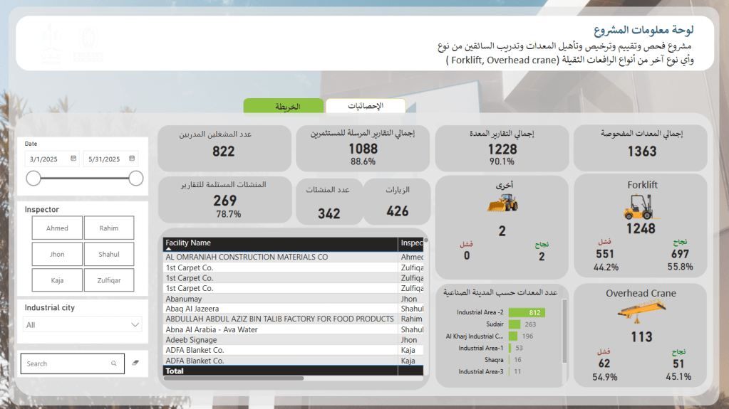
This Power BI dashboard was built to support a national-level program focused on the inspection, licensing, and certification of heavy equipment and their operators—including forklifts, overhead cranes, and other machinery—across multiple industrial cities.
🔹 Key Features:
• Comprehensive KPIs: Tracks total equipment inspected (1,363), certified reports issued (1,088), trained operators (822), and certified facilities (269), with performance indicators for success/failure rates.
• Dynamic Filtering: Users can filter by date range, inspector, and industrial city for customized insights.
• Equipment-Type Breakdown: Visual distinction between Forklifts, Overhead Cranes, and Other Equipment, with pass/fail results clearly presented.
• Facility Tracking: Lists facility names along with assigned inspectors and results, supporting full traceability.
• Geographic Distribution: Equipment count is segmented by industrial zones to identify high-volume or high-risk areas.
• Success Rate Analysis: Breakdown of pass/fail rates by equipment type—for example, forklifts show a 55.8% success rate out of 1,248 inspections.
Tools Used: Microsoft Power BI (Data modeling, DAX, dynamic filters, KPI visualizations, custom icons)
This dashboard showcases my ability to develop compliance and operations monitoring tools that support safety oversight, training programs, and regulatory enforcement across diverse geographic locations.
